A Component is a kind of workflow that can consist of multiple screens/steps. Any workflow that can be modeled using various components and UI steps, can also be created in a single component. It is often preferred to create components that are reusable modules to fulfil a specific function, for example, a component that only lets you choose a date. That way, you and even non-developers will be able to use your components to model different business processes.
Components are written in XML, and you can learn more about them from the Component Structure section.
User Interface
Depending on the component itself, there will be varied configuration options. If there is more than one, the tabs will be shown separately (e.g., General and Codes).
All configuration tabs are explained below for each component:
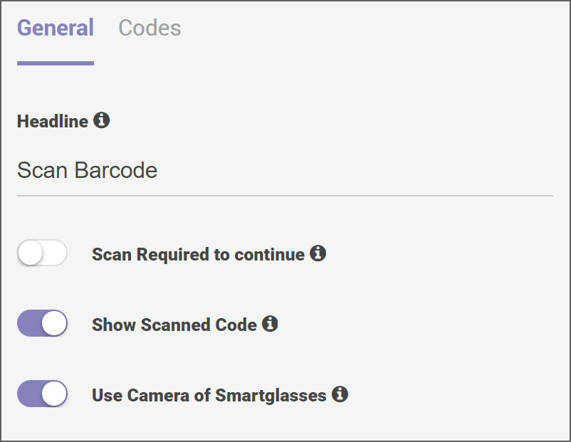
Barcode Scan
The Barcode Scan component can either be used with the smart glasses camera or with an external camera. It is used to scan different types of codes.
The Barcode Scan component is used in workflows that are related to Logistics (manual order picking, checking incoming/outgoing goods, defining inventory deficiencies, sorting, and packing), Production (tool selection and identification, supporting material management), Maintenance, Repair and Operations (equipment or parts inspection, tool selection and identification), Health and Safety (identifying and selecting the chemicals, detection of labelled laboratory items) and Authorization.
Configurations
- General: The General tab is for users to configure the title. It also includes toggle options for scanning the required codes to continue, displaying scanned code, and using the smart glasses camera.
- Codes: The Codes tab is for users to add and delete accepted barcode symbologies and define the regex of allowed values. The Results Settings subsection allows you to add and delete result variable names and use the toggle options to save results globally and enable reporting.
Output Values
- code: It will contain the scanned value of the barcode/QR code after a successful scan.
- success: Checks whether the scan was successful or not. If the scan is successful, assign it as true. If the scan is not successful, assign it as false.
- result: It will contain a string of labelled groups of the scanned code.
External Camera
The External Camera component allows the use of an external camera during the execution of the workflow. This records the reachable places with external cameras. It can switch between multiple cameras and provides the ability to take pictures from different angles.
The External Camera component is used in workflows that are related to Production (viewing and recording items easily without moving the HMD and reducing production times), Maintenance, Repair and Operations (performing maintenance checks, capturing images before/after the documentation), and Quality Assurance (streamlining the QA process by providing multiple views from different angles).
Configurations
The configurations tab is for users to define the title of the component interface, enter text for the instructions, the default camera selection, and the toggle options such as Enable Content and Allow to take pictures.
Output Values
- selected_button: Transition based on the button the user last selected. Assign the value of the last selected button in all caps, for example, RETURN or CONTINUE.
Checklist
The Checklist component allows multiple items to be checked, marked, or indicated.
The Checklist component is used in workflows that are related to Production (ensuring the quality of changeovers), Maintenance Repair and operations (performing defined operations within multiple tasks, observing safety systems when repairing/evaluating), and Quality Assurance (documenting checklists for frontline workers’ daily tasks).
Configurations
- General: The General tab is for users to define the component UI header. The Grid Settings subsection allows the user to specify the number of rows to be displayed per page and to use the toggle option for Show IDs per entry. The Advanced Settings subsection allows the user to configure which items must be checked and to use the toggle options for Show first only the required items and Reporting.
- Options: The Options tab is for users to manage the keys and values by adding more or removing the existing selections.
Output Values
- selected_list: Defines certain items that must be selected in output values.
- selected_string: Makes transitions based on whether the label was checked or not. Assign the value of the label as option 1 or first.
- complete_list: Defines all the items that must be selected in output values.
Date Picker
The Date Picker component allows users to choose a date via voice commands or record date arrangements by pushing the buttons.
The Date Picker component is used in workflows that are related to Service (recording the date of execution, determining the next date for inspection, setting dates for material orderings) and Logistics (capturing expiry dates for inventory processes).
Configurations
Configurations are for users to define the date format and the title for the component UI.
The Advanced Settings allows you to use the toggle option for Reporting.
Output Values
- date: Transitions are based on the selected date. Assign the value of the date selected by the user in the configured format.
- selected_button: Transitions are based on the button the user selected. Assign the value of the last selected button. For example, Return or Continue.
Documentation
The Documentation component allows users to perform documentation within the workflow. The user can choose the documentation type from the menu with the following options: Take pictures, record comments, take video, and take audio.
Note: The component functions the same as the documentation feature in the extended menu in the standard step templates.
All recorded files are available in the Frontline Command Center within task details within the used Solution (xInspect, xMake, xPick). All media files can be displayed as documented in the report.
The Documentation component is used in workflows that are related to Quality Assurance (supporting audits and inspections, recording quality violations and giving total quality reports, creating product trails, generating digital PDF reports), Maintenance, Repair and operations (collecting on-site data, capturing deficiencies, documenting damages), Production (assembling in-process documentation, batching documentation and capturing values), Training (documenting videos of best practices on the job by directly using the smart glasses), Environment, Health and Safety (documenting compliance with safety regulations) and Process Control (simplifying examination tasks, comparing different audits).
Configurations
The Configuration is for users to define the title of the component UI, which option the screen should display, the default zoom level and the use of the toggle option Allow Multiple.
Output Values
- selected_button: Transitions are based on the button the user selected. Assign the value of the last selected button. For example, Return and Continue.
File Viewer
The File Viewer component allows users to view a PDF document or a high-resolution image. The component reuses the existing mobile knowledge base of the Administrator.
File Viewer component is used in workflows that are related to Construction (viewing blueprints and technical drawings), Maintenance, Repair and Operations (viewing maintenance reports, diagrams, and instructions), Production (viewing the operating and manufacturing procedures), and Health and Safety (displaying data sheets and safety instructions).
Configurations
The Configuration tab is for users to define the document settings, zoom level, preview location, and navigation mode, and use the toggle options for Convert PDF to PNG, Show Preview, Move in zoom level 1 and Enable Continue Button.
Output Values
- selected_button: Transition based on the button the user selected last. Assign the value of the last button as Return or Continue.
Image Choice
The Image Choice component allows users to choose between two images.
The Image Choice component is used in workflows that are related to Quality Assurance (comparing the target/actual and the pre/post condition), Maintenance, Repair and Operation (performing condition-based maintenance checks), and Logistics (showing picking instructions in detail by image comparison).
Configurations
The Configuration tab is for users to define the title of the component UI, image, and labels for the Left image and Right image. Additionally the use of the toggle option Reporting under the Advanced Settings. When the Reporting toggle is disabled, it will not be possible to have the image available for reporting regarding the task process.
Output Values
- selected_button: Transition based on the button the user selected last. Assign the value of the used button as the label in the component in ALL CAPS, for example, LEFT IMAGE or RIGHT IMAGE.
Number Input
The Number Input component allows the user to enter multi-digit numbers. This component counts items by defining numbers via voice commands. It can also use the number output for further processing.
The Number Input component is used in workflows that are related to Inventory (verifying inventory accuracy, cycle counting, and detecting errors), and Safety and Environment (performing safety checks).
Configurations
The Configuration tab is for users to define the title of the component UI, speech prefix, and result variable name. Under the Decimal Input Settings, the speech point command. Also, the Reporting toggle option can be used under the Advanced Settings to enable downloading or exporting the PDF reports.
Output Values
- selected_button: Transition based on the button the user last selected. Assign the value of the last button selected in ALL CAPS for example in RETURN or CONTINUE.
- number_output: Transition based on the number the user selected. Assign the value of the number that the user selected.
Text Recognition
The Text Recognition component allows users to read and record texts. It is also beneficial to have less reliance on QR codes.
The Text Recognition component is used in workflows that are related to Logistics (confirming picking orders, outgoing goods, sorting, packing, and storing), Production (supporting equipment, material management, identifying tools and selections), Repair and Operations (inspecting parts and equipment), and Quality Assurance (confirming tool/product selection).
Configurations
The Configuration tab is for users to define the OCR detection language, OCR detection method, compression quality, region of interest, whitelist filter pattern (RegEx), validation pattern (RegEx), text border color, and text border width. Also, use the toggle options for Always use flashlight, Show detected borders, and Attaches The Image To The Report to include the captured images in the PDF report.
Output Values
- selected_button: Transition based on the button the user last selected.
- ocr_text_result: The detected result after applying the whitelist filter pattern.
- ocr_text_language: The language used for text recognition.
- ocr_pattern_matches: If the pattern is set, then this could be used to make desired transitions.
Paginated Text
The Paginated Text component displays textual information & long paragraphs. The component clusters the text so it can be viewed in several workflow steps, it automatically adjusts the UI and font with no need for adjustment in every step. This component can also reuse the existing textual instructions via copy-pasting within the workflow.
The Paginated Text component is used in workflows that are related to Production (to view and copy-paste textual task instructions for manufacturing, assembly, setup, and standard operating procedures), Repair and Operations (to display dynamic maintenance and repair procedures and task instructions), Training (to display text-based training contents), and Communication and Collaboration (to communicate urgent information or task assignments).
Configurations
The Configuration tab is for users to define the title of the component UI, text, and maximum characters per page within the Standard Settings. Under the Advanced Settings, the Reporting toggle options are available to enable downloading or exporting PDF reports regarding the task details.
Output Values
- selected_button: Transition based on the button the user last selected. Assign the value of the last selected button in ALL CAPS for example in RETURN or CONTINUE.
- last_viewed_page: Transition based on the last page the user viewed. Assign the number of the last page as 2 or 3.
ProGlove Pairing
The ProGlove Pairing component is used to pair HMD with a ProGlove scanner using the Insight mobile application.
The ProGlove Pairing component is used in workflows that are related to Logistics (manual order picking, checking incoming/outgoing goods, defining inventory deficiencies, sorting, and packing), Production (tool selection and identification, supporting material management), Maintenance, Repair and Operations (equipment or parts inspection, tool selection and identification), Health and Safety (identifying and selecting the chemicals, detection of labeled laboratory items) and Authorization.
Configurations
The Configuration tab is for users to define the title of the UI component and the description.
Questionnaire
The Questionnaire component is used to configure questions, checklists, and possible answers. This component guides employees through a series of questions and depending on their answers, it shows relevant information. The employee answers can be exported as PDF Reports.
The Questionnaire component is used in workflows that are related to Maintenance, Repair and Operations (to perform pre and post-checks, view condition-based maintenance, and guide testing procedures), Production (to view digital manufacturing and assemble checklists, and to confirm the right tool and material selection), Training (to check the knowledge of employees and facilitate further training accordingly), and Environment, Health and Safety (to assure preparations for safety at work, and to evaluate environmental factors).
Configurations
The Basic Settings is for users to define the title of the UI component, question, image, and possible answers. The Advanced Settings subsection includes the toggle option for Reporting to enable downloading or exporting PDF reports regarding the task details. While the Extended Menu comprises the toggle options for Call Support, Documentation, Pause Task, and Cancel Task.
Output Values
- selected_button: Transition based on the answer the user has selected. Assign the value of the selected button. For example, Return and Correct.
- content: The selected answer button of the smart glasses user.
Record Measurement
The Record Measurement component is used to measure values and compare them with a pre-defined benchmark. This component defines an expected value and operates ranges. It records measurements via Speech-to-Text. The user can get feedback when the value is out of the range. This component also visualizes the input value and operates range by number, units, scale, and colour.
The Record Measurement component is used in workflows that are related to Maintenance, Repair and Operations (to record real-time measurements, to give feedback about deviations from the normal values), Production (to compare actual and the target values, to digitalize the cross-check method), Quality Assurance (to check working operation ranges, tolerance, and norms), and Training (to use benchmarks in order to guide new employees through the standards and operating norms).
Configurations
The Textual Settings subsection is for users to define the title of the component UI, instructions, and measure icon.
The Range Settings subsection is for users to define the minimal value, maximum value, ideal range minimal value, measurement unit, and to use the toggle option Require ideal range.
The Advanced Settings subsection is for users to use the toggle option Reporting to enable downloading or exporting PDF reports regarding the task details.
Output Values
- selected_button: Transition based on the button the user selected. Assign the value of the last selected button as Return or Continue.
- measured_value: The value the user measures (it is only set if the user selects continue). Assign the value of the recorded measurement, for example as in 5.5.
- measured_value_including_unit: The value the user measured including the unit (only set if the user selected continue). Assign the value of the recorded measurement, for example as 5.5 cm.
- in-range: The value that the user entered is between the minimal and maximal values. Assign the value False if the value is not in range, True if the value is in range.
- under_range: The value that the user entered is below the minimal value. Assign the value as False if the value is above the minimum and assign it as True if the value is below the range.
- above_range: The value that the user entered is above the maximal value. Assign the value as False if the value is below the maximal and assign it as True if the value is above the range.
Selector
The Selector component is used to support the navigation via head movements for scrollable head movements. It allows the user to select from several configurable options and return the selection as output.
The Selector component is used in workflows that are related to Maintenance, Repair and Operations (to inspect different sites and zones, identify and select errors/deficiencies, display troubleshooting options, and selection of materials and equipment), Production (to sequence manual production work steps), Quality Assurance (to organize and standardize quality inspections and complex operations and to report digitally), Training (to diversify workflows based on details and complexity of the existing seniority/knowledge of the employee), and Environment, Health and Safety (to show correct actions based on the identified environmental conditions).
Configurations
- General: The General configuration tab is for users to define the title of the component UI, paginated grid menu under Selector Type, rows per page and columns per page under Grid Settings; use the toggle options for Show IDs per Entry and Show Default Cancel Entry under Display Options. The Reporting toggle option is under Advanced Settings to enable downloading or exporting PDS reports regarding the task details.
- Options: The Options configuration tab is for users to add and rename multiple options.
Output Values
- selection: Transition based on the button the user selected last. Assign the value of the last button, for example, as in option1 or option2.
- selected_text: Transition based on the text the user selected last.
Task Browser
The Task Browser component enables the user to start a sub-task within a Task or a Task Template. Through this component, the user does not have to leave one task and switch to another but can do so while executing the main task.
The Task Browser component is used in workflows that are related to Quality Assurance (to support multiple inspections, audits, and control rounds), Maintenance, Repair and Operations (to collect data from on-site collection and conditional reporting from multiple elements all at once), Production (to capture values from multiple elements), and Process Control (to simplify the examination task by running all the sub-tasks at once).
Configurations
The Configuration tab is for users to define the headline of the component UI, the selection basis (select by), the name filter RegEx, and to use the toggle options for Close Browser after subtask, Immediately start single task, and Include scan option.
Output Values
- tasks_started: Includes the number of tasks that can be selected by the user.
- tasks_paused: Includes the number of tasks that are paused for the time being but shown in the list to the user.
- task_available: The number of tasks that have been started by the user.
Browser
The Browser component allows the user to view live information from a webpage provided by an inserted and valid URL. Besides the URL input, this component needs no complex configuration. With the component, the user can display a webpage within a workflow.
The Browser component is used in workflows that are related to Production (to view and refer to any webpage information), Maintenance, Repair & Operations (to view and refer to operations information present on the web), and Environment, Health & Safety (to view and refer to safety standards present on the web).
Configurations
The General Configuration tab is for users to define the URL and scroll amount along with the toggle options; Enable JavaScript and Enable Scroll buttons.
xAssist
The xAssist component enables the user to call a Remote Expert within a workflow. It defines when the call should be started and checks for possible difficulties of the employees. xAssist directly supports employees operationally by remote calls.
The xAssist component is used in workflows that are related to Communication and Collaboration (to enhance the communication option and to verify the call with pre and post-remarks), Quality Control (to support the tackling of quality deficiencies remotely, and to perform visual cross-checks), Safety at Work (to direct contacts to Experts if necessary and to check for possible emergencies of the employees), Production (to have advanced quality control of a product by connecting a remote expert), and Maintenance, Repair and Operations (to support demanding service activities and enhance the ability of a technician service by remote export advice).
Configurations
The Configurations tab is for users to define the toggle option Enable call chain.
Safety Helmet Detection
The Safety Helmet Detection component detects if a worker is wearing a helmet or not. This component enhances safety standards in hazardous work environments.
The Safety Helmet Detection component is used in workflows that are related to Safety at Work to ensure the safety of workers and to document the safety standards of a workplace.
Configurations
The Configuration tab is for users to define the instruction text, and helmet confidence threshold and to use the toggle option Transition if valid.
Output Values
- selected_button: Transition based on the button the user selected lastly assign the value of the last button as Skip or Continue.
- classify_result: Output of the model, which in this case, is the helmet.
Connector Message
The Connector Message component enables the user to send and receive a message to and from the Frontline Connector. This component does not have a UI as it will send the message in the background while the user proceeds with the task.
The Connector Message component is used in workflows that are related to Warehouse, Logistics and Manufacturing, to help connect and send messages to third-party backend systems.
Configurations
- Message: This section is for users to define the title of the component UI and failure notification under Text Settings. While the commit message type, message content key, and the toggle option Send Asynchronous can be defined under Message Settings.
- Response: This section is for users to define the output mapping key under Output Settings, and to use the toggle option Show Response under View Settings.
Output Values
- success: Assign it as true if the component was able to fetch a data source from the server, assign it as false if it could not fetch a data source from the server.
- response: It is the string value of the response that was sent by the Frontline Connector.
Base Component
The Base Component enables the user to create a new minimal template component in Advanced Mode.
Configurations
The Configuration tab is for users to define the title of the component UI and the text to be displayed.
Output Values
- selected_button: Transition based on the button the user selected at last.
Sensor Connect
The Sensor Connect component enables users to connect to different kinds of sensors.
The Sensor Connect component is used in workflows that are related to Production (to visualize a wide range of production technology-related outputs and to support the machine operator), Maintenance, Repair and Operations (to display data for predictive and mobile maintenance procedures, and to interact with smart machinery, equipment, tools, materials, and products), Quality Assurance (to moderate and control sensor data to make sure processes are running as expected), and Environment, Health and Safety (to moderate environmental and equipment conditions).
Note: This component does not have any configurations or output parameters.
PDF Reporting Functionality
For tasks that are assigned and completed by the user, it is possible to create and export PDF documents with the task details.
Reporting will be possible when the End Step is clicked. There will be two options; PDF Report or PDF Questionnaire Report. Within either of this selection, the Frontline Command Center user will be able to see the following options:
After choosing, click on Open Report Builder.
(See Reporting for more details.)
⇒ Currently there is a sample of a PDF report.