Prerequisites
The imported Vision Picking Workflow as addressed by the Set-Up Guide can be easily configured by the user in the Creator according to the respective picking environment and can readily deploy a working solution.
How to proceed
In this section, you will learn about the various components of the Vision Picking Workflow and its available configuration settings.
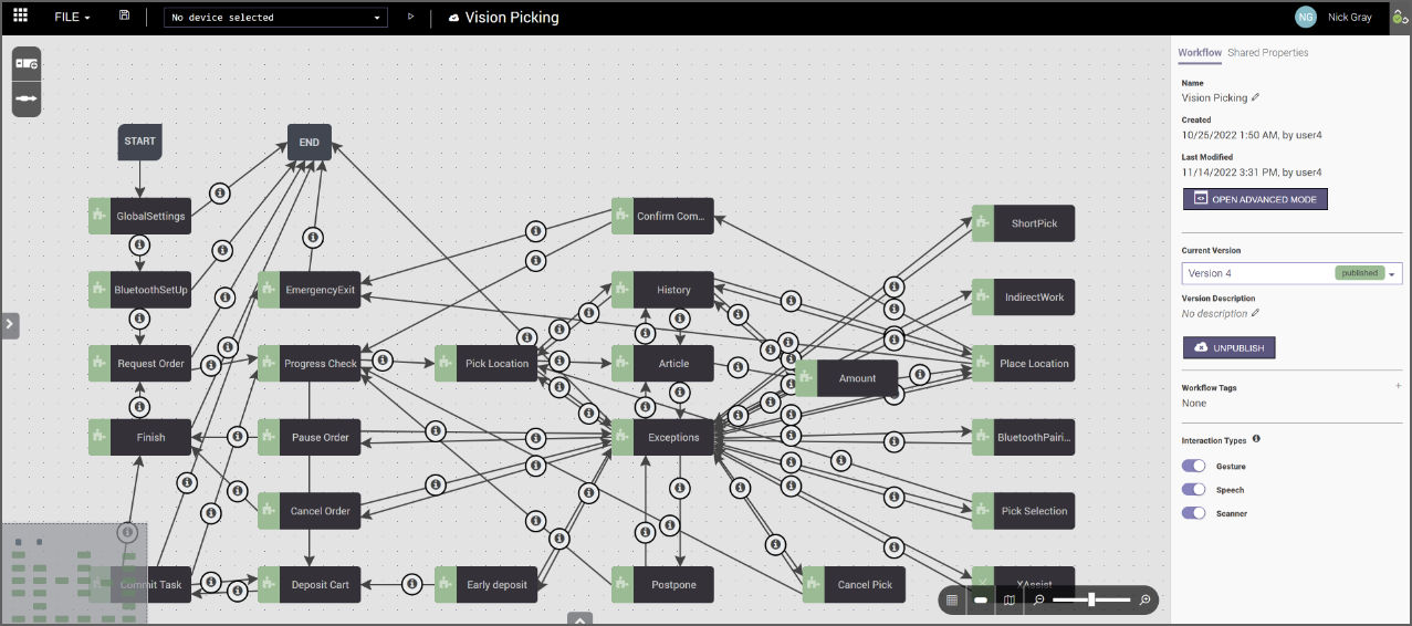
The image below shows the workflow that includes the components of the picking process:
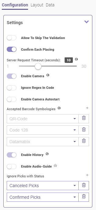
Shared properties
The shared properties can be viewed via the corresponding tab on the Workflow Properties panel of the Vision Picking Workflow. After selecting the workflow flowchart (background), the panel appears on the right side of the screen. It allows the user in the Creator to adapt the configuration for the entire workflow.
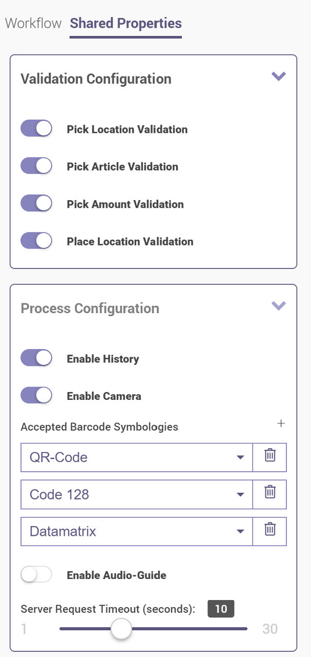
Validation Configuration (if enabled):
- Pick Location Validation - Allows validation of the location relevant for the picker.
- Pick Article Validation - Allows validation of the article relevant for the picker.
- Pick Amount Validation - Allows validation of the amount relevant for the picker.
- Place Location Validation - Allows validation of the put location relevant for the picker.
Process Configuration:
- Enable History - Allows access to the previously completed picks.
- Enable Camera - Allows the picker to activate the camera to scan codes.
- Accepted Barcode Symbologies - Defines the codes that are allowed to be scanned while executing the workflow. Codes can be chosen from the drop-down menu and are managed by clicking on the Plus or Trash buttons.
- Enable Audio-Guide - Activates the Text to speech functionality.
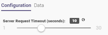
- Server Request Timeout (seconds) - Allows the user to define a timeout value.
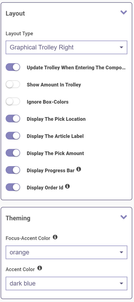
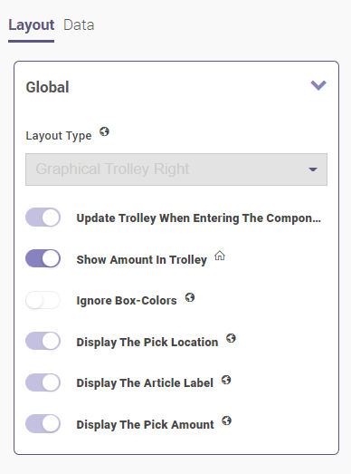
Layout:
- Layout Type - Allows the user to choose between Graphical Trolley Right or Text UI.
- Update Trolley When Entering The Component - Allows direct trolley updates when entering a component.
- Show Amount in Trolley - Allows the picker to see the amount in the trolley.
- Ignore Box-Colors - Ignores the coloring of the boxes.
- Display The Pick Location - Displays the location-picking location.
- Display The Article Label - Displays the article label.
- Display The Pick Amount - Displays the picked amount.
- Display Progress Bar - Displays the progress bar.
- Display Order Id - Displays the order ID.
Theming:
- This defines the color of the progress bar and highlights.

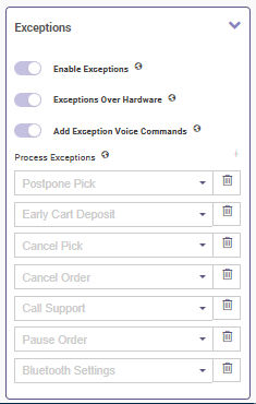
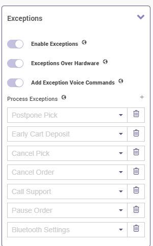
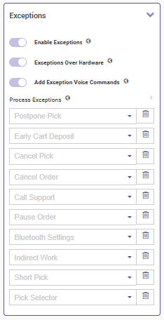
Exceptions:
- Enable Exceptions - Allows activation of process exceptions.
- Exceptions Over Hardware - Determines if the user can use the device's back button or not in order to show currently available commands. The button or gesture may vary depending on the device.
- Add Exception Voice Commands - Allows to display all available exceptions under the Show Commands list and the user is able to directly trigger the exception from the picking screen. Otherwise, the user must first say "Open Exceptions" to see all available exceptions.
- Process Exceptions:
- Postpone Pick - Moves the current pick to the end of the order.
- Early Cart Deposit - Cancels the rest of the order and the worker can move on to the deposit component.
- Cancel Pick - Cancels the pick.
- Cancel Order - Cancels the order.
- Call Support - Connects the Frontline Worker to the Frontline Expert via an xAssist call.
- Pause Order - Pauses the current order for the time being.
- Bluetooth Settings - Allows the pairing of an external barcode scanner via Bluetooth.
- Short Pick - Reduces the number of items that need to be picked.
- Indirect Work - Keeps track of the other activities while picking is in progress.
- Upload Image - Allows the smart glasses user to capture item images
Note: These process exceptions will also be shown as process exceptions under the Pick Location, Article, and Amount components which are explained in detail below. Process exceptions can be chosen from the drop-down menu and are managed by clicking on the Plus or Trash buttons.
Note: Exceptions must be activated for Frontline Workplace users to upload items to the workflow.
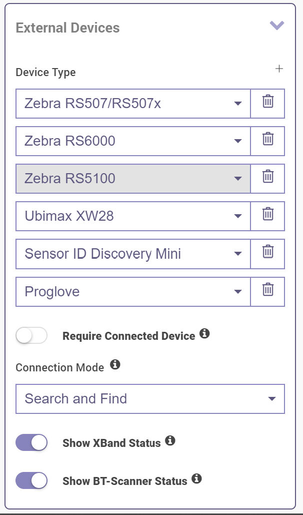
External Devices:
- This defines the allowed external confirmation devices that can be used. External devices can be chosen from the drop-down menu and are managed by clicking on the Plus or Trash buttons. Connected device can be defined as required via the toggles. It is possible to search for devices or to connect them via scanning codes.
- Require Connected Device - Connecting an External Device can be set as mandatory.
- xBand Status - Display the xBand Status widget on the Status Bar. Only activate this setting if xBand is part of your process. The widget will display the xBand pairing status (Red = Not Paired, White = Paired).
- Bluetooth Scanner Status - Displays the external scanner status widget that will be shown in the status bar. Only set it to on if an external barcode scanner is part of your process. The widget will display the scanner's pairing status (Red = Not Paired, White = Paired).
Vision Picking Workflow components
Upon selecting a component, the component property panel appears on the right side of the screen. The distinct configurations available for all components in this workflow are listed below. Certain components that are described in the Shared Properties section are not mentioned again.
GlobalSettings
The "GlobalSettings" component allows the user to edit all components within the workflow.
Request Order
The "Request Order" component manages pending/available orders.
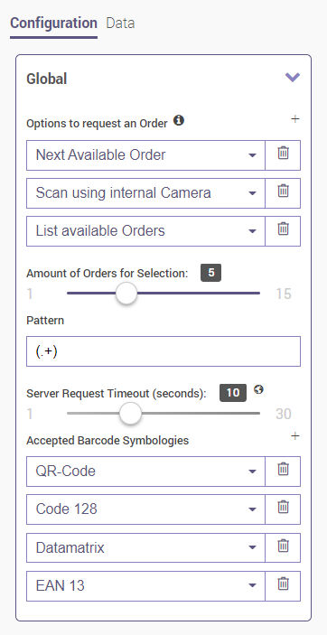
Global:
- Options to request an Order
- Next Available Order - Simply moves on to the next picking order in the sequence.
- Scan using internal Camera - Allows the user to scan the next picking order via QR code.
- List available Orders - Displays a list of available orders to pick from.
- Amount of Orders for Selection - Lists up to 15 orders from which the user can choose one to execute.
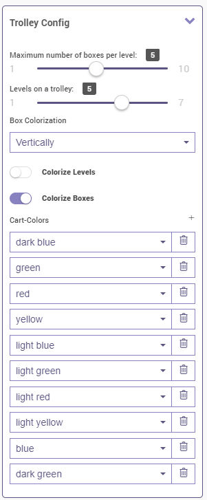
Trolley Config:
- The data in the uploaded sheet will be shown graphically in the trolley structure defined by the Creator user.
- It is possible to choose how many levels should exist in the trolley.
- You can also define how the box is colourized and whether it should be coloured vertically or horizontally.
- Colorize Levels - Allows to color the outer rim of the given level.
- Colorize Boxes - Allows to colorize the boxes. The user can add colours to the Cart-Colors list or delete them from it. The user can choose the desired colours from the drop-down menu.
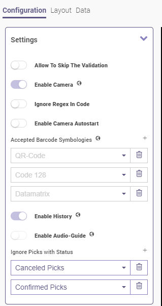
Article
The "Article" component manages properties related to article validation.

Settings (if enabled):
- Allow To Skip The Validation - Skips the current validation without the need to scan the article code.
- Enable Camera - Allows the user to activate the camera to scan codes.
- Ignore Regex In Code - Ignores the regular expression that defines which values are allowed to be scanned.
- Enable Camera Autostart - Starts the camera automatically when the component is in sequence.
- Accepted Barcode Symbologies - See the Shared Properties section for more information.
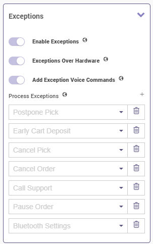
Exceptions:
- Process exception settings are inherited from shared properties and can be managed by clicking on the Plus and Trash buttons under the Process Exceptions menu.
- See the Shared Properties section for more information about possible settings regarding exceptions.
Amount
The "Amount" component organizes properties related to amount validation.
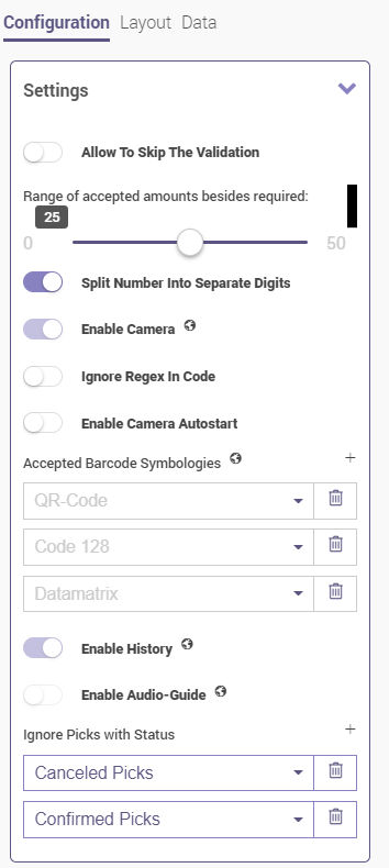
Settings (if enabled):
- Allow To Skip The Validation - Skips the current validation without the need to scan the article code.
- Range of accepted amounts besides required - Allows voice commands to be recognized in a certain range around the required pick amount.
- Split Number Into Separate Digits - Allows the user to say numbers in voice commands in a way that each digit is separate instead of the entire number being one word (e.g., the user is able to say "five-two" instead of "fifty-two" for an amount of 52).
- Enable Camera - Allows the user to activate the camera to scan codes.
- Ignore Regex In Code - Ignores the regular expression that defines which values are allowed to be scanned.
- Enable Camera Autostart - Starts the camera automatically when the component is in sequence.
Exceptions:
- Process exceptions are inherited from shared properties and can be managed by clicking on the Plus and Trash buttons under the Process Exceptions menu.
- See the Shared Properties section for more information about possible settings regarding exceptions.
EmergencyExit
The "EmergencyExit" component defines how quickly a workflow can be left. After 3 failed attempts to communicate with Frontline Command Center, the picker has the option to leave the workflow and return to the main menu. They will be prompted with an error screen that shows them the order ID so that they can inform their supervisor.
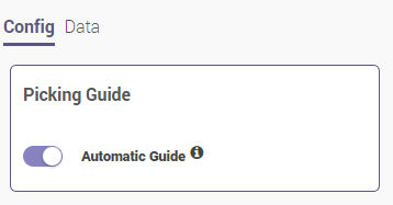
Progress Check
The "Progress Check" component determines if unfinished steps are allowed in the pick order or not. In the configuration, the user can define some layout options and picking can be guided automatically.
Place Location
The "Place Location" component shows the location to which the picked items are to be taken.
Settings (if enabled):
- Allow To Skip The Validation - Skips the current validation without the need to scan the article code.
- Confirm Each Picking - Confirms each placement.
- Server Request Timeout (seconds) - Defines a timeout between 1 to 30 seconds upon a request.
- Enable Camera - Allows the user to activate the camera to scan codes.
- Ignore Regex In Code - Ignores the regular expression that defines which values are allowed to be scanned.
- Enable Camera Autostart - Starts the camera automatically when the component is in sequence.
See the Shared Properties section for more information.
Exceptions:
- Process exceptions are inherited from shared properties and are managed by clicking on the Plus and Trash buttons under the Process Exceptions menu.
- See the Shared Properties section for more information about possible settings regarding exceptions.
Pick Location
The "Pick Location" component manages properties related to pick location.
Settings:
- Allow to Skip the Validation - Skips the current validation without the need to scan the article code.
- Enable Camera: Allows the user to activate the camera to scan codes.
- Ignore Regex Code - Ignores the regular expression that defines which values are allowed to be scanned.
- Enable Camera Autostart - Activates the camera automatically when the step is in sequence.
- See the Shared Properties section for more information.
Exceptions:
- Process exceptions are inherited from shared properties and are managed by clicking on the Plus and Trash buttons under the Process Exceptions menu.
- See the Shared Properties section for more information about possible settings regarding exceptions.
History
The "History" component shows the picks that were completed within an order.
Global:
- Layout Type - It is possible to choose the layout type as Graphical Trolley Right or as Text UI. When enabled, the following options become available:
- Update Trolley When Entering The Component
- Show Amount In Tolley
- Ignore Box-Colors
- Display The Pick Location
- Display The Article Label
- Display The Pick Amount
Exceptions
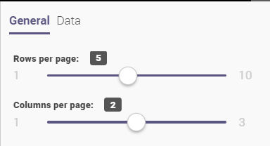
The "Exceptions" component displays the available exceptions of the current validation step. It is possible to determine the amount of rows and columns here.
Postpone
The "Postpone" component moves the current pick group to the end of the order.
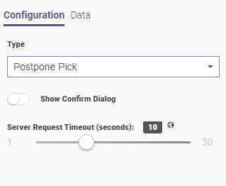
- Show Confirm Dialog - Shows confirmation from the Frontline Command Center.
- Server Request Timeout (seconds) - Defines a timeout between 1 to 30 seconds upon the user's request.
Pause Order
The "Pause Order" component pauses the current order and allows the user to continue at a later point.
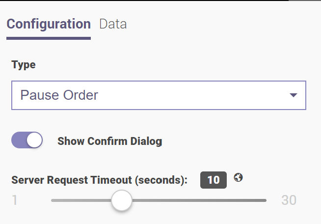
- Show Confirm Dialog - Shows confirmation from the Frontline Command Center.
- Server Request Timeout (seconds) - Defines a timeout between 1 to 30 seconds upon the user's request.
Cancel Pick
The "Cancel Pick" component cancels the pick.
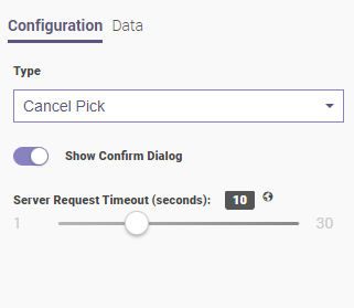
- Show Confirm Dialog - Shows confirmation from the Frontline Command Center.
- Server Request Timeout (seconds) - Defines a timeout between 1 to 30 seconds upon the user's request.
Early deposit
The "Early deposit" component closes the order. In this case, the already picked items will be confirmed and the rest will be cancelled.
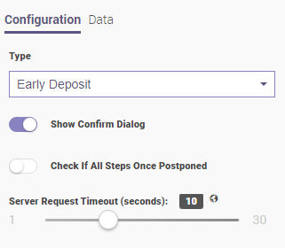
- Show Confirm Dialog - Shows confirmation from the Frontline Command Center.
- Check If All Steps Once Postponed - Makes it possible to see and check if the steps are not interrupted but postponed within the order.
- Server Request Timeout (seconds) - Defines a timeout between 1 to 30 seconds upon the user's request.
Confirm Commit
The "Confirm Commit" component confirms the result of the Frontline Command Center.

- Server Request Timeout (seconds) - Defines a timeout between 1 to 30 seconds upon the user request.
Cancel Order
The "Cancel Order" component cancels the order.
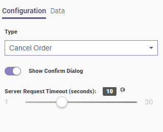
- Show Confirm Dialog - Shows confirmation from Frontline Command Center.
- Server Request Timeout (seconds) - Defines a timeout between 1 to 30 seconds upon the user request.
Pick Selection
The "Pick Selection" component manages the entered articles.
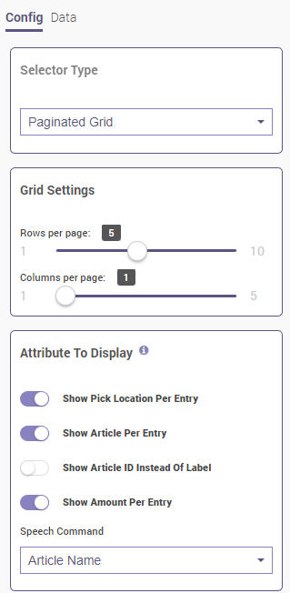
Selector Type:
- It is possible to choose between Paginated Grid and Scrollable Grid.
Grid Settings:
- It is possible to choose the number of rows (1-10) and columns (1-5).
Attribute To Display:
- Show Pick Location per Entry - Shows the picking location of the current task.
- Show Article per Entry - Shows article images of the assigned order on every step of picking.
- Show Article ID Instead Of Label - Hides the label but shows the ID of the article while completing the task.
- Show Amount Per Entry - Shows the picking amount on every assigned task.
- Speech Command - Can be defined as Article Name, Article ID, or Pick Location.
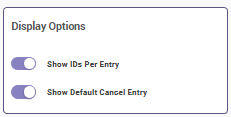
Display Options:
- Show IDs Per Entry - Shows article IDs when toggled.
- Show Default Cancel Entry - Shows the canceled article IDs when enabled.
BluetoothSetUp
The "BluetoothSetUp" component allows the user to pair an external barcode scanner via Bluetooth. It is possible to connect to multiple devices. It is possible to skip the component by toggling the button.
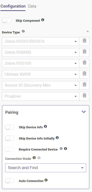
Device Type:
- Devices can be chosen from the drop-down menu and are managed by clicking on the Plus or Trash buttons.
Pairing (if enabled):
- Skip Device Info - Allows to skip the device info screen after pairing an external scanner.
- Skip Device Info Initially - Allows to skip the paired device info while starting the task
- Require Connected Device - Defines if there is a connected device by choosing between Search and Find and Scanning Code mode or if there is no connected device. When Search and Find is selected, all available devices are searched and the results are filtered depending on the device.
- Auto Connection - Allows the user to directly connect with a device instead of waiting for a full search.
BluetoothPairing
The "BluetoothPairing" component serves to set up Bluetooth while picking. This is basically the same as the Bluetooth Setup component but accessible within the actual picking process in case the picker needs to change the scanner in the middle of an order.
IndirectWork
The "IndirectWork" component keeps track of side tasks for FCC while the picking is in progress.
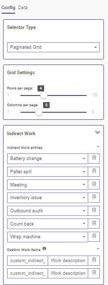
Selector Type:
- It is possible to choose between Paginated Grid or Scrollable Grid.
Grid Settings:
- It is possible to choose the number of rows (1-10) and columns (1-5) .
Indirect Work Entries:
- Indirect Work entries
- Battery change
- Pallet spill
- Meeting
- Inventory issue
- Outbound audit
- Count back
- Wrap machine
- Custom Work Items
- It is possible to add or remove custom values by clicking on the Plus and Trash buttons.
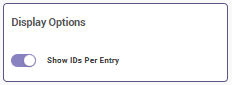
Display Options:
- It is possible to show the IDs per entry.
ShortPick
The "ShortPick" component functions as an exception when there are less items required.
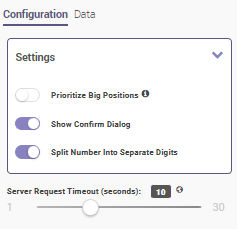
Settings (if enabled):
- Prioritize Big Positions - Smaller positions will be canceled first if enabled.
- Show Confirm Dialog - Allows to show and confirm the picking prioritization.
- Split number into separate digits - Allows the user to say numbers in voice commands in a way that each digit is separate instead of the entire number being one word (e.g., the user is able to say "five-two" instead of "fifty-two" for an amount of 52).
- Server Request Timeout (seconds) - Defines a timeout between 1 to 30 seconds upon the user request.
Commit Task
The "Commit Task" component confirms the Frontline Command Center result step.
- Server Request Timeout (seconds) - Defines a timeout between 1 to 30 seconds upon the user request.
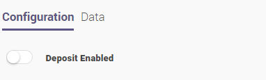
Deposit Cart
The "Deposit Cart" component requires the picker to scan the deposit location where they placed the cart in the end. The user can activate or deactivate the deposit by toggling the button.
xAssist
The "xAssist" component allows the Frontline Expert to provide instant instructions to the Frontline Worker.
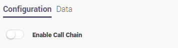
The component within the Creator enables the user to call an expert within a workflow. It defines when the call should be started and checks for possible difficulties of the employees. xAssist directly supports employees operationally via remote calls.
Also, the Frontline Workplace user can:
- Hang up the call
- Disable/Enable the microphone
- Adjust the volume
- Take pictures
- Adjust the brightness
- Enable/Disable the flashlight
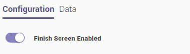
Finish
The "Finish" component ends the workflow. The user can finish the enabled screen by toggling the button.