New improved user interface for easier navigation
By now, we are sure you could not stop noticing the complete overhaul of the desktop client in TeamViewer.
We are here to tell you why we improved the design and how can you benefit from it.
The new design condenses and simplifies multiple windows and tools into one easy-to-use, re-sizable client window. This has been achieved as a result of several months of rigorous design iterations, user feedback sessions, and thoroughly tested usability trials.
We are proud to state that at the end of our efforts, we could meet the usability and design expectations of most of our users on the new TeamViewer interface. Other than achieving usability benefits, we also wanted to elevate TeamViewer into a modern, state-of-art contemporary design.
Here’s what has changed in the new client:
One resizable Integrated window
Instead of multiple windows, you now have one integrated window providing you all the options to take action. Our usability tests revealed that a single integrated window was far more usable than multi-window interface.
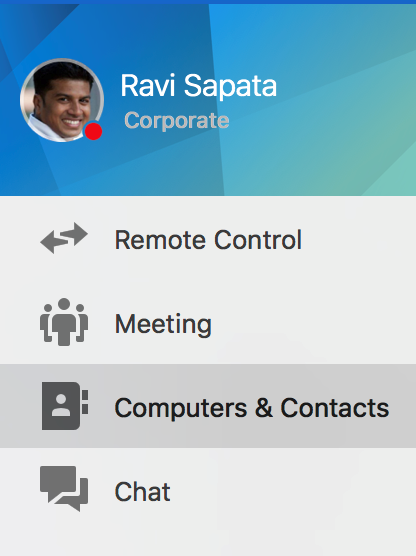
Left Navigation Bar for Common Actions
The common actions like making Remote Control connections, scheduling Meetings, viewing the Computers & Contacts list and making chat conversations have moved to the left navigation bar.
They are now easily identified by their respective icons. In our usability tests, we found that this is a better design because users can now easily know in which section they are – Remote Control, Meetings, Computers & Contacts or Chat.
New Computers & Contacts List
If you have been using the older TeamViewer client, the first thing you would have tried to find is the Computers & Contacts window. In the new client, the Computers & Contacts list is not in a separate window but part of the integrated client.
You can view it by clicking on the Computers & Contacts icon in the left navigation bar. The one that looks like a address book.
Make the Computers & Contacts list always visible
One feedback we consistently received was that our users always wanted to keep the Computers and Contacts list visible on their computer screen. They did not want to move to another tab when establishing e a remote connection to contacts / devices which were not contained in their list
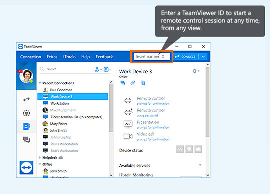
The good news is that with the new Instant Connect control at the top of the TeamViewer client (see illustration below), you can insert partner IDs to make remote connections without leaving the Computers and Contacts view.
Recent Connections
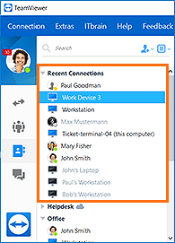
The other enhancement that you would have noticed is a new group in the Computers & Contacts list named Recent Connections. This group lists the devices and contacts with whom you have made any of the following actions:
- Remote control
- File transfer
- Send file
- Meeting
- Video call
This is a nice productivity enhancer to quickly make connections from a recently used list instead of searching for the device and contact all over again.
Enhance your productivity
We hope that the new TeamViewer client helps you to enhance your productivity skills and get better at supporting your clients.
By the way, this is also an optional design – if you still feel you want to use the old interface, you can do it by unchecking the Use new interface checkbox in the Options menu.
Credits to the author of this Blog Post: @Ravi
Former Community Manager
Comments
-
I'm not a fan to be honest, I much preferred the previous look and feel. Since it offers no actual other benefits, it looks like it's just a change for changes sake, either that or someone trying to justify their job role. In addition, having this pushed on us midway through the working day caused no end of issues with my users. Perhaps an option to change it back would be nice, even nicer would have been some notification that the change was going to occur...
If you touched it and it stopped working, the first question to ask is "Did anyone see me touch it..."15 -
Nice work, so I'm curious for the next step of productivity. The beginning of a remote session is not even half of the job. The work of users is done in the remote sessions. There we need another boost of productivity!
0 -
I completely agree with you.
BTW you can go back to the old user interface by unklicking "use new user interface" under Extras - Options. (the menue text might be different as I use the german version).5 -
Kwa bahati mbaya, mimi huongea tu na kuelewa Ujerumani vizuri.
Kwa hiyo itakuwa bila shaka kuwa nzuri kama unapowasiliana nami katika lugha hii.m-s0 -
No. Definitely no. It's a big step back in usability and flexibility. Normally I'm working 99% with 'Computers an Contacts' in a separate, slim window using the entire screen-height at the side of my screen. Beside a manual connection to a new user/client I can do anything from there. The whole thing is a 100% fail, the new GUI and also the uncontrolled way of activation in the middle of the day. Still stupid, but at least it's possible to deactivate that great new super productive GUI. Btw., if you let trainees work on client related stuff you should control them better!11
-
I agree with everyone who hates it. i used every possibility reporting the new interface is **bleep**!
Now u roll out a newsletter where u say 9 of 10 users are satisfied with the new interface....im really sure it is the other way aroundI'm a corporate customer since Teamviewer 5, and i would say that you take notice of all that comments which will come in here now and think about if this redesign was a complete waste of time!
you should never force your customers on anything...so keep the option with the old interface or im gone!
9 -
Liebes Sales Team
Ich habe gerade eine Mail erhalten wie unglaublich toll das neue Interface 9 von 10 Usern finden. Ihr wollt mir die neue Oberfläche «verkaufen», was mir etwas merkwürdig erscheint, denn wäre die Oberfläche gut, bräuchtet ihr diese Mail nicht zu versenden (the dark side of the sales). Wenn sie gut wäre, würde man/ich die neue Oberfläche auch ohne diese Mail adaptieren. Ich nutze Teamviewer, weil es ein gutes Produkt ist, und nicht weil ihr mir was verkaufen wollt.
Ich bin wohl 1 von 10 Leuten, die die Änderung nicht sehr toll finden. Ich stelle mir die Frage, ob eure Aussage valide ist, dass 9 von 10 Leuten zufrieden sind. Wie genau macht ihr da die Auswertung? Nutzen die 90% zufriedenen User Teamviewer genau so wie die 10% unzufriedenen? Ich habe den Tag über etwa 60 Computer online und keiner deren Benutzer nutzt Teamviewer so wie ich. Allein hier ist das Verhältnis 60:1. Ich finde das neue Design schick, keine Frage, aber ist es auch nützlich? Sicherlich ist es super für den 0815 User (eure 9 von 10, meine 59 von 60) mit 1-2 Computern in der Leiste welche die Chatfunktion selten brauche. Natürlich unterstelle ich hier und ich bin sicher nicht der wichtigste Poweruser, aber ich nutze es praktisch täglich, für alle Kunden.
Nur ein paar Beispiele:
- Wenn ich eine Nachricht an den Computer schreibe,
- popt das Chatfenster auf dem Mac Client gar nicht auf, nicht mal eine Notifikation (1) erscheint, der Benutzer muss selbst nachschauen gehen, ob eine neue Nachricht da ist.
- blinkt zwar Teamviewer, aber der Benutzer muss selbst auf das Chat register klicken, um die Nachricht anzuzeigen. Vorher hat er auf das Blinkende Chatfenster geklickt und da war die Nachricht.
- So ist für mich als Admin die Situation einfach unbefriedigend, da sich die Kunden schon schwer tun auf das blinkende Symbol in der Taskleiste zu klicken und jetzt ist es noch umständlicher.
- Computerliste
- Allein schon Recent Connections braucht mit dem neuen Client ein drittel des Platzes bei einem normal geöffneten Client.
- So viel weisse Fläche bei Computer und Contacts, warum soll ich mir den rest des Bildschirms mit weisser Fläche zupflastern lassen, wenn es vorher auch ohne geklappt hat?
- (so am rande, warum lässt sich nicht einstellen (Advanced Settings), dass das Teamviewer sich nicht verkleinert, beim Öffnen einer Verbindung. *nervig*)
- Quickconnect
- Finde ich super, noch besser wärs aber, wenn man gleich den Namen der Computer angezeigt bekommen würde, die man in der Computerliste gespeichert hat.
Herzliche Grüsse
5 - Wenn ich eine Nachricht an den Computer schreibe,
-
The new UI is not definitely better! It is unclear, misplaced. I hope you keep the original UI. The new UI is a big step wrong.8
-
Definitely not a improvement and it has switched twice on me now without asking for it. Interface is way too busy and smooshed together. Old interface is much more conducive to the large client list i have. I would have rather you worked on a way to share my machine list to my other colleagues in one click rather than having to add my contacts one group at a time! We have the business version so we are being tortured now we all can't log in with the same username and have the license on the machine!
6 -
es tut mir wirklich leid sagen zu müssen, dass ich das neue UI nicht gut finde. Ich habe mich bemüht und habe sie damals bei der Version 12 ausprobiert und nach fünf Minuten wieder auf die alte Version zurückgeschaltet.
Wie schon andere hier bemerkt haben, empfand ich es als reichlich unverschämt, dass mit der Version 13 ohne Rückfrage wieder dieses neue UI aktiviert wurde. Sie ist genauso schrecklich zu bedienen wie beim ersten Versuch
dafür erneut 10% Preiserhöhung zu verlangen ist dann der zweite FAIL.
#uxfail
4 -
I agree, the new UI is no go!
I`m working as IT-Admin and it is not possible to work with new GUI. Who from TV has this brilliant idea?It is all in seperate windows and too big. In classic GUI all in one place.
9 of 10 are happy, I do not belieive it, TV should learn to count it right.And yes, TV, you have spend hours for nothing, accept it and please let the classic GUI on.
Or make it like MS, not hearing your customers and spend money for nothing.
4 -
The new interface is horrible. It's for tablets, at best. Multi-site tech support folk like myself woring with two or three monitors at once need the flexibility of the previous interface. I think that TeamView has confused "lack of complant" with "like" in claiming that the new UI is so popular.
6 -
I can't believe 9 out of 10 users like it.
It's too big and less intuitive.
I'm still waiting for an option to turn OFF the recent connectons. It drives me mad.
6 -
Yes, the option to turn OFF the recent connectons would be great.
TV are readieng this?4 -
I'm going to join the others by saying NO! The new interface is a real pain. What is more, it was not needed in the first place.
Most users of TV will use it for Remote Control - almost exclusively. Some may use it for presentations or communications, but they are mostly not the same people who use it as a remote control tool, so why give us this wonderful way to switch between modes we never switch between?
Searching for a partner ID may be fine if you are managing servers or similar headless devices. For helping users, it's useless since, in the first instance, the user needs to want your support and (at least in my case) to start up their TV, so they would show up on your list anyway.
Another feature, which I've complained about before is the "Recent Connection" which appears - always expanded - at the top of the window. Recent Connections are the ones I don't need to see again just now! It's the actual, live users that I need to see so I can connect to them.
I love TeamViewer, but it is a product which is getting more frustrating all the time with the addition of features that are annoying and counterproductive, so please give us a simple (call it "basic" for all I care) interface and let us get on with our job of using the software rather than fighting it.
4 -
Die beste Funktion der neuen GUI, ist diese auszuschalten.
Das 9 von 10 Benutzer die neue Oberfläche gut finden, ist ein Witz. Die Berechnung dürfte wohl so erfolgen, alle welche die neue Oberfläche aktiviert lassen finden diese gut und alle anderen - wie ich - welche diese deaktivieren, müssen anschliessend eine Bewertung und den Grund angeben und gehören zu den 10%. Also für den Normaluser der supportet wird, spielt dies sowieso keine Rolle. Alle Poweruser oder Admins welche das Tool täglich Nutzen, wechseln auf die alte Oberfläche.
Also meine Behauptung ist das 9 von 10 User welche das Teamviewer installiert haben, diese Tool nicht aktiv Nutzen (also supportet werden) und 1 von 10 User, verwenden es täglich aktiv und wechseln auf die alte Oberfläche.
Das Teamviewer die neue Oberfläche breitflächig aktiviert finde ich schlecht, das man dann aber beim wechseln auf die alte Oberfläche noch immer mit einem Bewertungsfenster konfrontiert wird (welches ich sowieso wieder schliesse) finde ich eine Zumutung. .
2 -
I must be the 10th user. Also not a fan of the new UI. Among many other complaints, where is the "collapse groups" feature? With the already limited computers & contacts connections window size if I can't collapse all the groups down, it's even harder to find the computer I'm looking for. Make the computer details portion of the window go away or at least give me the option to make it smaller or turn it off completely. If I want to see the computer properties, a right-click isn't that hard. Looks more like an always-on advertisement taking valuable screen real estate to promote TV's other products that I'll never use.
The "remote session" box in the top-right would be useful -- it's 99% of what TeamViewer is used for anyway.
3 -
Dear Community members,
Thank you very much for your valuable feedback!
We are always happy to receive feedback on our new features and improvements and I can assure you we are reviewing the comments and statements we get carefully. We always use our users’ feedback to improve the user experience of TeamViewer.
The latest change - from multiple windows to the integrated window solution - was implemented to increase usability and make our software future ready for new features to come.
One feedback we have consistently received is that users, especially heavy users, need to have the Computers & Contacts list visible at all times. This is why we introduced the new Instant Connect control in the top menu. Now you will find all in one place and you do not have to leave the Computers & Contacts list anymore if you want to insert a partner ID to connect to a new device.
DomCom, m4Zz, Servolk, BenUK, Telxon
We are continuing to gather and evaluate feedback regarding the need for a fully responsive window size.
m4Zz, BenUK, Servolk, Dunedin,
The Recent Connections list can now be collapsed, so that in this state it does not consume more space than one line.
m4Zz,
Since the latest version, the TeamViewer window does not minimize any more when establishing a connection so that you can have the Computer & Contacts list in view at any time.
Best regards,
Anna
UX Designer0 -
So I updated to the newest version and still don't see the "collapse groups" feature any more. It's great that I can collapse the recent connections, but I want to collapse all the groups at once instead of scrolling through the entire list collapsing groups as I go. It was in the old interface, I want it in the new one.
2 -
Dear Anna,
maybe you overlooked that there can be different sorts of heavy users. I for myself have many entries in the computer list and seldom need to use a new id. Instant connect doesn't help me for my workflow - managing several Teamviewer host installations. Only the Computers & Contacts list is useful, but polluted with that recent list.
Regards, Robert
3 -
How do you start a new post!! I cant even figure that out!!
0 -
Hi TeamViewer,
I think you are currently running into the trap of applying the Single-Page-Application principle from the web to the desktop environment.
On the desktop you naturally use multiple windows, you can arrange them as you want to get the maximum of your screen space. Think of it as a the "workbench" of a craftsman: he also arranges his tools by himself so that he can be ultra-efficient. I also would like to have this kind of thinking in the TeamViewer-UI.
On a tablet it's different, there you usually use full-screen in one window. So I would like to see an adaptable/customizable TeamViewer-UI, depending on the form factor.
And as one user wrote: the main window is just the start, it's the remote session window where you need to be productive as a supporter. Please also think about improvements there, this is the most important UI in TeamViewer.
The Watcher3 -
I also think the "collapse all" feature is missed a lot!!
3 -
It's frustrating. TV14 is out now and still this unproductive UI, it's just a pain. The 'integrated window solution' is the worst decision TV made in the last years, especially for power users/admins. Computers & contacts is completely unusable like that. Thanks for your valuable feedback but sorry, the main problem cannot be solved...haha. They just don't get it. It's got even worse - new functions (Sub-Grouping (finaly!), Dark Mode) cannot be used in classic mode. Seems TeamViewer is not interested in Pro-Clients anymore.
4 -
Exactly! I don't understand, why they don't just add a button in the new Interface "Pop Out Window" and that's it, everyone is happy. And they don't have to maintain two Interfaces. I still wonder which person at TeamViewer wants the new Interface so badly as it is right now, I bet it's not a power user. Also the integrated chat - like already mentioned - is worthless, if the window does not pop up or blinks, so the user on the other side sees that I wrote something. I always have to connect first to the computer, open the customers teamviewer, go into the customers teamviewers chat, and THEN he sees what I have written.
- Thank you for correcting the "minimize window" issue, at least in the "Computers & Contacts" window.
- Instant Connect: is not really an option, if the main window closes after each connect. But I'm happy, that the seperate Window keeps beeing open at all times.
- Dark Mode is only available in the new interface. Well that's annoying.And not to rant around all the time: I think TeamViewer is still the best remote management software there is, for me, the yearly license is worth a thousand fold. Thank you for your good work everyone. (execpt the stuborn interface guy ;-)
3 -
You are right m4Zz, I also think, TV is still the best remote support tool. It's just annoying TV goes the same way like many (still) sucessful companys: They stop listening to their customers or they only hear what they want to hear. Since TV brings new functions only for the new UI, it's clear where it ends: Either you pay for functions you cannot use or you go the way Productmanagement thinks is best for you. And sooner or later there will be no 'back to the classic UI' option. Then you can bite the bullet or change your remote supporting enviroment completly. I hate decisions like that. And I do not like companys bring me in such situations.
2 -
Deutsch:
Ich denke es gibt irgendwo einen Management Trainer, den alle super toll finden.
Der erzählt den Managern, wie sie erfolgreich Software Programmieren.Die erste Grundregelt:
Halte es einfach!
Keine Optionen und keine Funktionen für weniger als 1.000.000 User.Code der nicht vorhanden ist, kann keine Fehler haben.
Also Regel 2:
Schmeiße allen Code aus der Software von dem Du nicht weißt wofür er ist, oder den weniger als eine Million User einfordern würden, wenn Du ihn entfernt hast.Regel 3:
Beauftrage die Werbe-Abteilung, jede Änderung als den großen Sprung darzustellen und wenn die Leute es nicht wahrhaben wollen, dann behaupte es noch mehr.und fast die letzte Regel 4:
Wenn jetzt die Leute weniger Anreiz haben deine Update zu kaufen, dann mach ein Abo Modell daraus. Dann müssen die Nutzer immer zahlen, ob sie die Entwicklung gut finden oder nicht.
Sollten die User dann wirklich kündigen wollen, kommtnun aber wirklich die letzte Regel 5:
Baue eine Abteilung auf, die den Usern die das Abo kündigen, das blaue vom Himmel verspricht. Notfalls sogar das sie weniger bezahlen müssen.Der Managementkurs kostet pro Tag und Person 17.000 Euro und findet im Chedi in der Schweiz statt. Natürlich mit Spar und allem.
Englisch, autotranslation:
I think there's a management coach somewhere that everyone thinks is super great.
It tells managers how to successfully program software.The first basic rules:
Keep it simple!
No options and no features for less than 1.000.000 users.Code that does not exist cannot have any errors.
So Rule 2:
Throw all the code from the software you don't know what it is for, or claim that less than a million users would claim if you have removed it.Rule 3:
Hire the advertising department to portray every change as the big leap and if people don't want to perceive it, then claim it even more.And almost the last Rule 4:
If now people have less incentive to buy your update, then make a subscription model out of it. Then users always have to pay whether they find the development good or not.
Should the users really want to cancel then, comenow really the last Rule 5:
Build a department that promises the users who cancel the subscription that promises blue from the sky. If necessary, even that they have to pay less.The management course costs 17,000 euros per day per person and takes place in the Chedi in Switzerland. With Spar and everything, of course.
m-s0 -
The coding rules are so true, Digon.
It seems TV and many software firms make it that way. Good to know.0 -
Did they really deactivate the old mode with the latest update?? Can't even find the option in "Advanced". Now it's getting annoying. Teamviewer, do something.
2