Wow - what a week!
With the latest TeamViewer release 15.23., we are introducing a new Look and Feel for the TeamViewer full version and our Management Console 🎉
While being excited about the changes, the release put a bit of a workload on the whole Community team 😅
You all know, that we want to have our Knowledge Hub articles always up to date, and for sure, we wanted the articles to represent the new look and feel as soon as possible.
Well, we did it!! We worked night and day to replace screenshots and how-tos for you in the last few days. And now, we are proudly presenting the updated Knowledge Hub to you!
But let´s talk about the actual changes too 👇
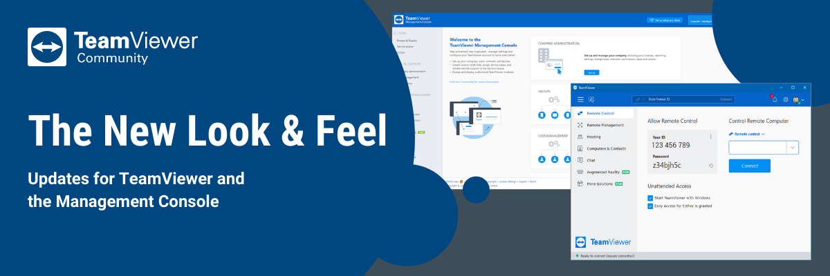
The new Full version
For the full version, there are improvements in the navigation, status bar, and for remote control.
While we noted down the changes in our Change Log, I thought I make you a graphic to show you the changes for an easier understanding and visual help:

💡Hint: Click the image to open it in a new tab to read the tooltips easier.
With the changes, TeamViewer is looking much cleaner and it is easier to navigate! Did you notice the gear wheel in the upper right corner? It is your one-click path to the TeamViewer options (my personal favorite to be honest 🙌).
Well - that´s it in a nutshell for the full version. Now let´s head over to the Management Console
The Management Console
The Management Console got a complete overhaul and it is looking awesome!
A lot of you will be more than happy to hear that we got rid of most of the popups when entering a menu. Now, we are smoothly opening up in-page menus that are simply intuitive! Give it a try!
The first thing, I want to mention is the fact that we now have a grey-themed version for our Tensor customers and a blue-themed version for our customers with Remote Access, Business, Premium, and Corporate licenses:


You might have noticed that there is a new start page too that you can always reach when clicking on the logo of the Console in the upper left corner. It leads you to some of the most relevant parts of the Console smoothly.
However, the real power of the new layout of the Management Console is in the details. It is now way more intuitive, way more modern and this will most likely make you way more productive when working with the Management Console. I actually dare to add a list of bullet points here. I´d rather invite you to explore the changes yourself.
If you have not worked with the Management Console before, let me spoiler you a bit: The Console will increase your TeamViewer experience by a lot!
Did you already check out this article about the Management Console? I highly recommend reading it to learn more about what the Management Console actually is.
And now, I would love to end this post by presenting you three highlights from the last release:
User Groups and User Roles and updates to our Conditional Access!
- User groups are automatically created and maintained via the same integrations you can use for the account creation like SCIM configurations for Okta, Azure Active Directory, AD Connector or API.
- User Roles allow for better administration of users within a company profile. A set of existing roles allows you to distribute the user accounts to certain roles that have a pre-defined permission set.
- Feature Options within Conditional Access allow you to customize your rules, e.g. if certain users/User Groups should only have limited access rights when connecting to specific devices.
That´s it for today!
Let me know what you think about the UI improvements and whether you already checked out the updated Knowledge Hub articles!