Sunsetting the multi-window user interface
Answers
-
Steps to Resolve 'It's Not a Bug, It's a Feature.' Interface
1. Contact TeamViewer-Support and report that the Interface is broken (because it is)
They will tell you that Its no longer supported (got to step 2)
2. Tell Support in that case you need the download link to 14.3.4730 as the Broken Interface is unusable
You need to keep following up until they send you the functional version of TeamViewer (patch 14.3.4730) (Its a broken interface you will need to treat it a Mission-critical bug that MUST be resolved)
3. Sadly once you have the correct Installer you will need to turn off the auto-updates until the 'It's Not a Bug, It's a Feature' interface gets resolved.
This can be found here:
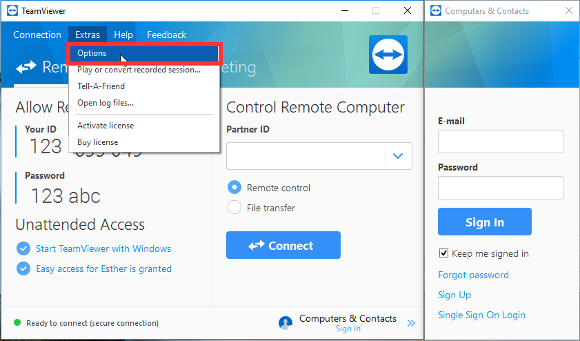
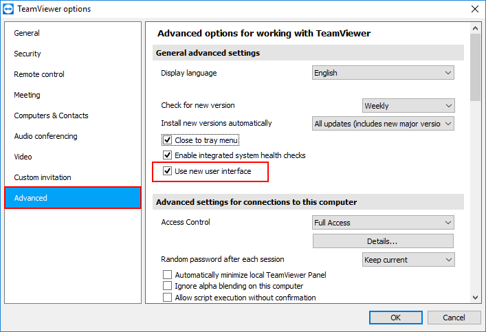
(Also untick the "Use new user interface" and fill in the popup)
Hopefully, they fix the 'It's Not a Bug, It's a Feature.' interface soon.
4. After doing the above steps follow up weekly with there TeamViewer-support to find out how the 'It's Not a Bug, It's a Feature.' Interface repair is going.
(You have disabled auto-patching this is now a security risk so you must follow up consistently)Last but not least Good Luck, I am unsure how TeamViewer let it get to this point, but I believe it will be on the users to get this resolved, Spend as much time with the support team as you need to get this resolved.
TDLR
Get Version 14.3.4730 (Last Stable Version) Install it, turn off the auto-update, follow up with Support until issue resolved.2 -
Why?
Who wanted the new UI?
Did You even ask the customers?
Where is the reason and the public customer survey for such an unreasonable major change?
We did not get asked about this kind of major GUI change and calling it sunsetting is a slap right into the face of Your paying customer base. Shame on You!
What is so wrong about multi user windows, if You have multi remote connections and multi monitors on Your desk? It's like "**bleep** Yeah get the new SingleCore CPU. So the CPU can focus on only one task at once for You!" or "Get the new OS for 1000$. it only allows You to open one programm at once, so that You can focus on it!" Please think a little bit about the upgrades, before unleashing then to the world and not just because You need an upgrade forced by the management!Teamviewer gets more and more borked with every version!
We use Teamviewer since many years (version 5), but your very wrong business decissions make it almost impossible to keep teamviewer in our company. It's like Skype. Skype was great for many years, but since Microsoft bought it in 2011 it has been rendered meaningless and unusable for many customers.
This applies to Teamviewer, too. Despite the fact, that it was only a **Third Party Product** client with and private hosted gateway server, it got more expensive with every version and the update interval decreased from aprox.3 years to 1 year without any real benefit for the average user.
Adding the security issue at top of that (Teamviewer hacked etc,) I think we all should consider a change of remote software. Since money seems to bee the only language teamviewer management seems to understand.
THANK YOU YERY MUCH TURNING GOOD SOFTWARE INTO TRASH.
6 -
I called support yesterday, and voiced my opinion. They said they would put me on the "List" of users who hate this new interface. I urge you to call and let them know.
They also sent me a download link to the June version 14.3.4730, which can use the old interface (just make sure you turn off the automatic update).
5 -
opened a ticket. Requested a fixed version with option to switch back to the old UI and not the
"Intuitive Desktop UI"
which is a big joke.
4 -
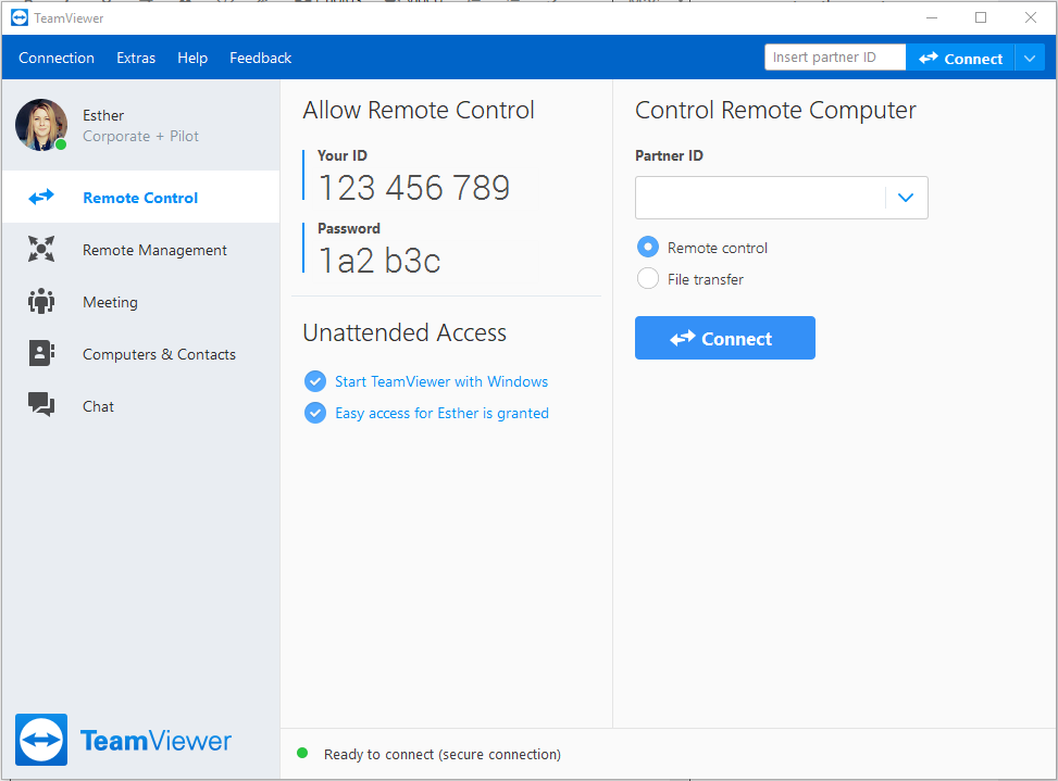
We personally hate the new user interface. Why you took away the ability for an end user to make a choice between what you think is best and what they personally want to use I will do not understand. Why couldn't you leave the ability to choose between the classic interface and what you think is new and sleek? some of us work for a living and need all the real estate we can get on our monitors. Your new interface takes up entirely too much room. The dockable single interface in the multiuser setting was great. Even your competition, log me in, has a thick client that the single view pain.
Bring back the ability for the end-user to make the choice between what kind of interface they want to use. Our at a minimum bring in the choice to have a dockable interface if we choose or a small foot interface. This was a horrible business decision to take away choices from your clients.
I do hope you actually pay attention to social media. You not getting good reviews over this last move
3 -
Hi there,
Thank you very much for your feedback regarding the new user interface.
We are aware that the window takes up too much space for some use cases and we will approach that subject.
Please stay tuned and we will inform you as soon as there are any news about it.Wish you all a great start into the new week and all the best,
Christian
Senior Manager, Product ManagementSenior Manager, Product Management0 -
I can't understand why you're patronizing the users. A choice whether to use the old or new user interface would still be useful.
Many users like me feel that the new interface is an absolute no-go.
I will go back to the June Teamviewer version and switch off updates. I hope you'll take note of the fact that the Replys indicate that apart from the developer, nobody thinks the new interface is good.
2 -
Funny how some people say "it's for you" and then take away our options and it's NOT for us. The new large window interface stinks. I want to see ONLY the slim contacts window. Many/most of us don't NEED any of the other windows constantly on screen. This is just another attempt to look like you are doing something "new" and "exciting" but actually making a program HARDER to fit into a user's work style. So sad.
@Esther3 -
The problem is that the developers are not actual USERS of their own product. They THINK they know what will work well, but are not forced to use their changes on adaily basis. All of our users need a small, compact window for contacts and nothing more. The new "interface" is actually a grab for more screen real estate, as though they are a bill board. It add nothing more in terms of FUNCTIO at all. It only takes up more real estate and requires MORE clicking. Why??? Because someone had to prove they are needed at the company as a programmer or they feel they may not be needed - so, program worthless changes to point at something they "did."
2 -
Exactly. We are a licensed user, and I've written Teamviewer multiple times about suggested improvements, but they don't listen. Whoever is working on the platform is definately not an end user.
So any suggestions for alternatives? We won't be renewing our licenses. Thanks.
Another user just suggested Cloudberry. Has anyone used it?
2 -
Hi all,
Thanks a lot for your feedback.
We value your opinion, and we appreciate active and critical users!
Please rest assured that we are reviewing all feedback and as @Christian_PM mentioned: we are already working on this topic.
We believe the best way to build a better product is in collaboration with our users. Your feedback is crucial for understanding your needs and solving the right problems. To achieve that we have our User Focus Program. In this program, you get exclusive previews and can give early feedback on ideas, concepts, and potential new features!
It would be an honor to have you in our program and we would like to invite you to apply for the program here: https://content.teamviewer.com/en/teamviewer-user-focus-program/
We are looking forward to receiving your feedback on the UI and other ideas, concepts, and potential new features soon.
Thanks and best, Esther
Former Community Manager
0 -
MUCH agreed! This new interface is ridiculous to work around now! Takes up WAY too much screen instead of only a couple of inches long list. The option to still use the old list SHOULD have been kept for those who still prefer it
3 -
WOW And I thought I was the only one the HATED the new interface! As most have said it's WAY TO HUGE! I hate it in Linux, I hate it in Windows!
I have rolled back to 14.3 in windows so I'm not forced into giving up a 1/3 of one of my screens for nothing! In Linux at least after EVERY TIME I open TV I switch to contacts (the only thing I care about), drag it to half it's starting size. (STILL TO BIG) But near as annoying as the Windows version!
I know if I post any other remote software in here it gets removed. But I have sugestions on what you may try instead of forcing the MONSTER HUGE WASTE OF SPACE. Like a few others in here I'm also trying other software. I have had TV business use since version 10 or 11. But this new interface, can't just open to contacts, recent connections... So many things sending me over the edge.
Maybe do this:
1. Let us choose the default start? I think most using this as our job only want contacts?
2. Maybe have one HUGE windows but have the contact list on the bottom and working window on top, with tabs (someone else does this)
contact list on the right or left working window next to it, with tabs. (someone else also does that)
Right:
Left: (This being my favorite of the huge interfaces)
And like I said their are other companies that already use the interfaces I just posted. I like TeamViewer and would like to stay with TV. But this new interface needs to go!
(Of course you can add an area for your ads, special stuff... on the FREE VERSION)
Thank you.3 -
@Christian_PM @Esther
Can we have an ETA on a fix, please?
"Please stay tuned and we will inform you as soon as there are any news about it."
It has been a month since your last update regarding the broken Interface patch.4 -
Still HATING the new HUGE waste of space interface! SO SUPER ANNOYING! But if I stay on version 14.3 (nice slim strip of JUST CONTACTS) it keeps crashing. So I'm forced to use the MONSTER WASTE OF SPACE version 14.6. So it looks like it doesn't matter what we like or makes life faster and easier on us?
Can we at least KILL WITH EXTREME PREJUDISE, DELETE, REMOVE, I NEVER WANT TO SEE IT AGAIN the STUPID "Recent Connections"? Who does that work for? I have a couple hundred computers in my contacts and it jumping all the way to the top to the "Recent Connections" is even worse then the huge waste of space on my left screen! No really it's like 33% of one of my 40 inch screens just to see contacts.
2 -
New version still HUGE, still has no way to not eat up 33% of one screen, still has the worthless "Recent Connections" with no way to disable it! I love looking at the 3.5 inches of wasted space.
Really PLEASE let up resize it to a normal size or give us the ability to split like 14.3. I don't need anything but contacts. AND PLEASE ADD AN OPTION TO DISABLE, REMOVE, DELETE RECENT CONNNECTIONS. Then the three or four people that like can still use it4 -
Hi all,
I just finished posting the Change Logs for TeamViewers January release (version 15.2) and wanted to take the chance of giving you a personal update on the latest Windows release.
Based on your feedback and the discussions with our members of the User Focus Program, our dev teams re-worked the TeamViewer interface and implemented a Slim Mode for the Computers & Contacts list.
Hint: To activate it, simply resize the TeamViewer window while you are within the Computers & Contacts tab.
The TeamViewer Insiders and the members of the User Focus Program have been testing the new Slim Mode during the last few weeks, and our dev team is currently collecting all feedback for further improvements.
Pro-tip for even more convenient work: Use the new right-click function on your computers or contacts to view a context menu :-)
If you like to become a member of the User Focus Program yourself to work together with our devs and other TeamViewer users on the future of TeamViewer, please apply via this link: https://ufp.teamviewer.com/join
We hope you like the new Slim Mode, and we are looking forward to receiving your feedback to make TeamViewer even better in the future.
Thanks and best,
Esther
Former Community Manager
11 -
Thank you
2 -
Thanks for your feedback @Pilgrimlea ! I appreciate the time you took for writing this.
I understand all of your points and please rest assured that the right people here at TeamViewer will read and evaluate it!
Thanks again and have a great day,
Esther
Former Community Manager
1 -
OMG THANK YOU SO MUCH!!!
I have over 200 computers in my list I like the tabbed windows in Windows but I HATED 30% of a 40 inch screen being used with half of it always blank. Now if I'm on Windows I can use my TV!
Now a tabbed version Linux and life would perfect. LOL Yes we always want more.
It is funny Windows yes the name is perfect WINDOWS everything needs another dam window but Teamviewer! In Linux file manager, browsers, text editors, email... everyhting is tabbed view but TeamViewer. LOL
Thanks again for SLIM MODE!!!But I do agree with "Pilgrimlea" 14.3 interface was the best for multi-monitor users. I used to do the same thing he does nice slim contacts on one screen, chat on another, computer on the center. But this is a step in the right direction.
3 -
Wonderful to see that you are working on this, listening to feedback.
I love slim, efficient, wokflow-optimized interfaces and I don't think I'm alone. Don't we all want things to be hidden while we dont need it and visible when we want them?
You are closing in on the clean contact list some of us love with this Slim Mode. For a simple solution, I'd say make the top and left bar optinally hideable, and voilà... a lot of customers happy. Perhaps a setting that says "Hide all bars automatically in Slim Mode" and when enabled the bars only show when ALT is pressed and released?
Other thoughts regarding "immediate access but still hidden until we want it" :
- Integrate the instant connect function into the search field. If we type an ID that is not in our contact list or recent connections, allow us to instantly connect to it.
- Integrate the "recent connections" into the search bar instead? When the search bar is selected but empty pushing down arrow on the keyboard (or clicking a small icon only visible inside the search field when it's selected but empty?) we get the recent connections. Might be worth testing to see if it's intuitive.
1 -
Man I have NEVER seen a company this ignorant before. You clearly do not listen to your customers, NOBODY likes this new interface, it isn't new it is an INFEROIOR interface in EVER facet! First you state you are going to violate the law and illegally violate contacts of people who PAID for a perpetual license in September and then you "offer as you call it" the option to use a "newer version" as you call it that looks terrible and doesn't even have the same interface. Your clearly doing this to avoid getting sued out of existence and it isn't going to work. This interface is unacceptable, please re-enable the REAL User interface as I will call it because that is what we paid for and that is what we purchased when we PURCHASED a lifetime PERPETUAL License. Either that or LIVE UP to your original CONTRACTS (not optional, CONTRACT) and keep version 8-10 open like you legally are REQIORED TO per the PERPETUAL CONTACT!
If you cared at all about your customers and evidence certainly shows you don't: At the very least for as dishonest and inept as Teamviewer has become you could LISTEN to your customers that PAID YOU! and re-enable the CORRECT interface, the Interface we all like, use and PAID FOR. This new interface is Garbage!
What is the latest version I can install that uses the REAL Interface?
0 -
What a shock crickets... Can you hear that Teamviewer? That is the sound of your company being sued out of existence, no less than you deserve!
0 -
Thanks for the advice here. I have to use the free version because that is what our tech guy at work chose. He insists the new interface gives the ability to use multiple monitors. Consequently he will not look for a better remote viewer.[removed per Community Guidelines] Of course I cannot fix my work computer until I return next week so I will probably have to go through these steps a few times because it is trying to say that there are conflicting versions on my computer. But oh well, these beats the heck out of that **bleep** program. And yes I have sent probable 20 messages about the new **bleep** interface they try to shove down our throat.
0